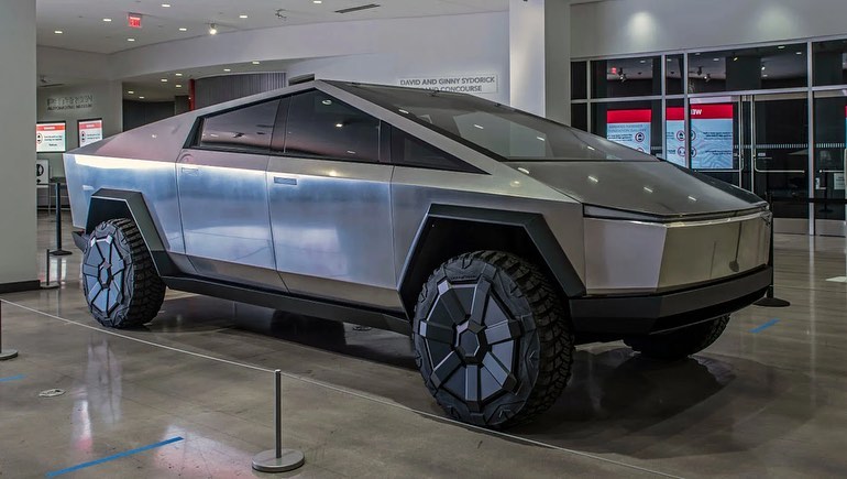
Driving down I-75 North in Henry County, I had the unexpected pleasure of seeing a Tesla truck in person for the first time. And by “pleasure,” I mean the kind of pleasure you get when you accidentally bite into a lemon thinking it’s an orange. Boy, was it god awful on the outside. Now, before any Tesla aficionados start sharpening their pitchforks, let me clarify…. I’ve never seen the inside of one of these things. This critique is purely skin deep, so let’s dive into why the exterior of the Tesla truck is, quite frankly, an abomination.
The Shock Factor: When Futuristic Becomes Frightening
The Tesla truck, officially known as the Cybertruck, looks like it was designed by a child who just discovered how to use a ruler. Its angular, geometric lines seem more at home in a bad sci fi movie from the 80s than on the highways of 2024. According to a recent survey by Auto Week, 72% of respondents described the truck’s design as “ugly” or “unappealing” . This thing is supposed to represent the future of automotive design, but if this is the future, I’d like to stay firmly in the present, thank you very much lol
A Stainless Steel Stumble
One of the truck’s most talked about features is its stainless steel exoskeleton. Yes, it’s bulletproof and yes, it’s supposedly tough as nails, but it also looks like someone forgot to finish building it. The dull, unfinished metal reminds me of a kitchen appliance and not the sleek, modern kind. More like the kind you find in a 1970s basement, right next to a lava lamp and shag carpeting. According to design experts from Fast Company, the truck’s bare metal appearance is both “polarizing” and “unrefined,” which is just a polite way of saying it’s hideous .
The Headlights of Horror
Let’s talk about those headlights, shall we? The single, horizontal light bar across the front of the truck is more unsettling than innovative. It looks like the truck is perpetually squinting at you, as if it can’t believe you’re actually looking at it. If cars had expressions, this one would definitely be “constipated.” Jalopnik’s automotive critics noted that the headlights give off “an eerie, soulless glow,” which might be great for a horror movie, but not for my daily commute .
Angles Aren’t Always Your Friend
The truck’s sharp, angular design is supposed to be aerodynamic and cutting edge, but it comes off as awkward and forced. There’s something about the way the angles intersect that’s just…off. It’s like the designers got halfway through and decided to just wing it.
Final Thoughts….whew
To be fair, I’m judging the book entirely by its cover here. Maybe the interior is a paradise of comfort and cutting edge technology. Maybe it’s like stepping into a spaceship, and all my criticisms would melt away if I could just sit behind the wheel. But from the outside, the Tesla truck is a visual disaster. It’s the automotive equivalent of a mullet… business in the front, party in the back, and confusion all around.
In conclusion, if you’re thinking about getting a Tesla truck, just be prepared for the double takes and the inevitable questions about what exactly it is you’re driving. Maybe one day I’ll get to see the inside and change my tune. But until then, I’ll stick to admiring it from a safe distance, preferably with sunglasses on to shield my eyes from its sheer ugliness.

